If you're in this for the learning, make sure to read as much as possible. I know a lot of it is long-winded and may come off as borish or intimidating, but bear with me. You won't gain what you're after by just looking at the pictures!
NOTICE: All artwork in this tutorial is copyright Carrie "Kirada" Rule and may not be altered or copied in any form without my direct permission. All photography is cited to its copyright holder; same terms apply.

To begin with, lets talk about
tools. I am using a
Wacom Bamboo Pen Tablet with
Adobe Photoshop 7.0. Everything that I'm doing can be applied to other Photoshop programs, and perhaps even GIMP. (I'm not sure about Photoshop Elements -- the best you can do is try!) With enough patience you can even accomplish most of this with Microsoft Paint.
If there's one thing that drawing a horse requires, it's a
lot of patience and a good sense of calm. It's extremely easy to get frustrated with drawing anything. So if you're new to horse drawing, I suggest you find some good stock (don't forget to ask permission!) to
reference (not trace). As I say in all of my other tutorials:
Do not reference from another artist. They, too, have mistakes, and by using their art as a source of information you are thus transferring their art flaws into your art! There are many tutorials on DeviantART that can help you, as well; I will link you to those per your request.
 Before you starts drawing, have an idea in your head. What the scenery will be, what your subject will be doing, and so forth.
 Never start with a blank canvas. (: As I'm still a little uncomfortable with drawing horses myself, I always have a reference or two handy -- even if what I'm drawing isn't a precise reference of the photo(s) I'm working with.
So, we have my reference.
 Photography Copyright Bob Langrish: USED WITH PERMISSION.
Now, on to the drawing fundamentals. As with anything I suggest you start with a "stick figure."

This is actually my second "stick figure" in the drawing. The first is, quite literally, a few sticks and circles. (If you'd like to see that one, ask. I'll be happy to show it to you.)
As you can see, I used some simple shapes: A trapezoid for the neck, ovals for the shoulders, sticks for the legs and circles for the joints. This breaking down of the anatomy, you allow yourself to spot out any potential errors that need to be fixed before you get to the "point of no return." I also suggest that you work on multiple layers instead of doing this all on a single layer. This helps preserve your work; when you erase, you don't erase everything. Per usual,
SAVE OFTEN!
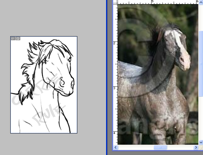
Below you can see my setup when I'm referencing images. The green "box" around the drawing and the circle around the reference displays how I would be zoomed in on my current focal point -- in this case, the kicking horse's bust. The "Navigator" is used to show where you are on the image with the red box, sort of like a "map."

Now lets move on to the preliminary sketch, which comes before the line art. This is like making the line art itself, only once again used to pick out any errors before you move on into the more serious stuff. Now for the rest of the tutorial I'm going to focus on the kicking horse, instead of both of them.
° Make a new layer
above the sketch.
° Change the
opacity to somewhere around 25-50%, so you can see your new sketch better. I suggest you sketch now in a color slightly darker than the original color, but not black; this will be your line art color.
TIP: When horses are scared or exhibiting aggressive behavior, you can see an exceptional amount of the "white of their eye." This is a sign to other horses, as well as the handler(s).

Now, on another layer, is when I go over with a third (but still not black) color to fill in some more details into the drawing. It's a good idea to zoom in; it helps prevent wobbly lines, as well as aids you in seeing what you're doing better.
TIP: Draw on a large canvas; such as 1,000 pixels by 1,000 pixels. You can make it smaller later, and when you do so your lines will be neat and clean looking! When using a large canvas, you can use a 3-4 pixel-sized brush for your lines without the hassle of hard-to-see thin or "fuzzy" thicker lines on a smaller canvas. Later, go to Image > Image Size, adjust, and voila!

Now for the most consuming part: line art. Per usual, zoom, keep your reference(s) on call, and take your time. There's no rush. If you start to get frustrated with your art, take a break and do something else you enjoy for a little while.
So again: Change the opacity of your sketch layers to 25-50%. Make a layer above the last drawn layer (the very top layer) for your line art. I usually merge (right click > Merge down for some, CTRL + E for others, including me) the sketch layers together as-is, without restoring the 100% opacity of the previous layers. This helps keep everything neat.
As you can see, I made some subtle changes to give the art my personal "touch."
That's it for this tutorial! If you have any questions, feel free to ask via reply or private message.
Up next: Drawing the entire body, coloring!
Until next time!