
Kion's changing design


Disney confuses us with Kion's design before show release
I wish to write this article and gather all the designs of Kion that Diney is presenting us on official promo and merchandise images. Some aspects of his design varies on precticaly every new official Lion Guard image that is released an it might be confusing for many fans who would like to draw him.
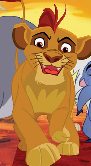
1. First promo images
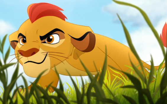
Here we have the first images of Kion that Diney has released in public. We see a yellow lion cub with a red mane tuft in several tones of red, brown nose, ears with black stripe and brown rim. His eyes appear orange in white backround, unlike the other lions in Lion King who have yellow eye background. His eye rounds are brighter at the bottom and darker brown at the top. He has a characteristic leg spots and shoulder mark in the shape of lion paw. The fullbody image shows that his underbelly marking is going up his neck like on female lions.
2. Disney sizle reel
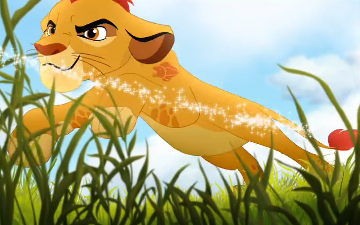
A short animation of Kion shown in Disney sizzle reel. His appearance is the same as in the promo picture of pouncing Kion, except his shoulder mark was changed from paw pad to roaring lion. This is the only time the roaring lion mark appears.
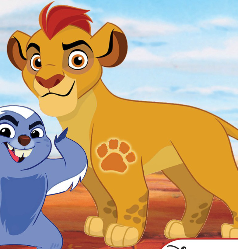
3. Meet The New Guard
An image of Kion and his Lion Guard that appears in the cover of the book "Met The New Guard". Kion's eye rounds change colour to dark brown on both top and the bottom. His eyes appear darker reddish-brown. Black ear stripe is gone and so are leg spots and shoulder mark. His underbelly marking end on the chest now.
4. Bunga The Wise / Bunga's Big Adventure
The cover iamge of "Bunga's Big Adventure". Kion's appearance is close to his "original" one except the eye rounds that are now darker and more greyish. His shoulder mark has a glowing outline.
5. Hear Me Roar! / Can't Wait To Be Queen
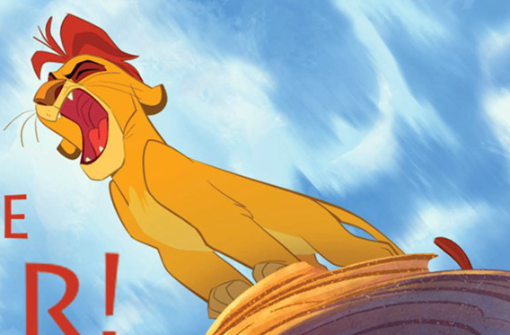
The cover of the book "Can't Wait To Be Queen" (previously "Hear Me Roar!") shows Kion without his leg spots and shoulder mark. His underbelly marking end on chest again and his eye rounds are dark red (so far the darkest of all images).
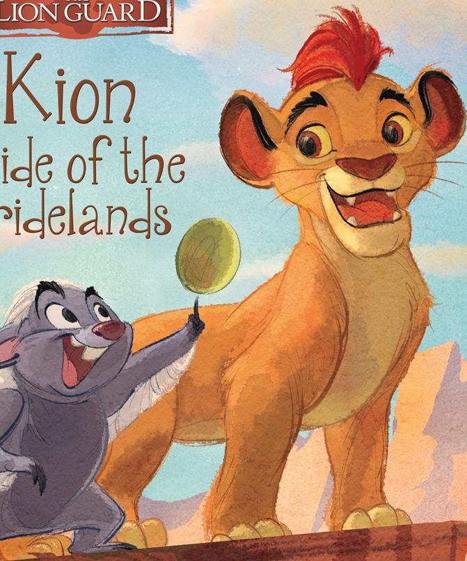
6. Kion, Pride of the Pridelands
The book "Kion, Pride of the Pridelands" had two covers.
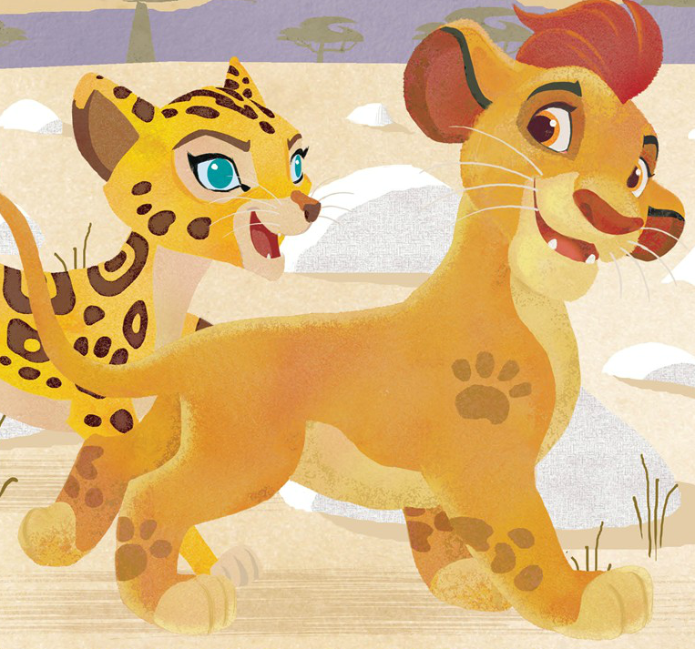
First cover shows Kion close to the first promo design, except his eye rounds are darker and more greyish. It also shows that Kion's shoulder mark appears on his right arm too.
New cover of the book shows Kion without his shoulder mark and leg spots again. His eye rounds are close to the first promo, being darker on the top and bright on the bottom again. Kion's eyes change colour to darker red-brown on yellow background. His fur also appears more orange, but it might be just the shading.
That's all. I hope I could clear out some confusion. I know myself how annoying it it when a character can't keep a defined design. I guess we'll have to wait for an official release to see how Kion really looks like.
Similar articles


Return

Last comments
| May 11, 2015 | ||
Site Builder (Content), Site Builder (Co...   | ||
| Big Bad Mod |
Yeah I think the final/show design is going to be the one used in
promo pics/sizzle reel, but all teh changes in book covers are really
confusing. I like the "Can't Wait To Be Queen" design because it
reminds me of Scar xD Plus it make him more unique and less like Simba
or any typical pridelander. |
| May 11, 2015 | ||
Site Booster  | ||
| You're one in a minion |

I like the Can't Wait To Be Queen design, since I've never been a big
fan of his birthmark or spots. And wow, I never noticed how different the designs were on each book cover until you pointed this out xD It's obvious Disney is going to use his lion birthmark and spots on his legs (if this design is official) for the actual TV show, but I would prefer to see less on him, if you know what I mean. |
| May 11, 2015 | ||
| | ||
| Roll to the Rescue! |

Disney needs to pull themselves together and pick a design, rather, a
realistic design. The second cover of Kion, Pride of the Prideland's
seems more reasonable and it shows him to resemble his parents, more
or less, in some manner. However, this is merely my opinion, and I prefer "less over more" when designing my own characters! Which probably explains why when I make adoptions they're never adopted out completely. People like their mass markings I guess  |
 | May 11, 2015 | |
| | ||
Return
Lion King reads and more


Site activity
Who is Nuka's Father? Troll Berserker - 84 days Are fuli and Kion a couple? TLKEmi2838 - 115 days Kiburi Baadaye Role Play SnowLeopard - 147 days Learn Swahili - Quotes and Activities lionobsession - 153 days Did Zira survive? Auburn SandWing - 161 days Why do you like Zira? Mighty - 252 days Vuture shock confusion - need member's opinions Shivu - 292 days Is Scar or Simba guilty? Girlwithatornear - 297 days What was Mufasa going to do to Simba? JeanZedlav - 305 days The lion guard my opinions/theories Troll Berserker - 375 days "Thank you so much for th... SnowLeopard - 12 h Great art! And congrats f... Reba_andUnicorn333 - 13 h Yes feel free to delete t... CloudyPawz - 17 h Yeah, we should! :) SnowLeopard - 20 h Thanks, Cloudy! :) SnowLeopard - 20 h I love these two, too! Gr... SnowLeopard - 20 h I love reading these! The... GirlsAloudDiva - 1 day Hey! Been a while GirlsAloudDiva - 1 day This is so cute! Thank yo... GirlsAloudDiva - 1 day Wonderful drawing Snow :D... CloudyPawz - 2 days| Members online : | + 51 other visitors |


Image :

Fanfic :
- Friends?, by The_Lion_King_PageHow did Simba and Nala meet?
Character :
- Giza (WW), by WaywardAngelGeneral Birthname: Giza Nickname:
none. Meaning: Dark Age: Varies Breed: Lion
Appearance Pelt Color: Very dark rust...
Question :
- Difference Between Good and Bad Renders?, by DarkAngel001 Okay, I've been on this site a while now and
because I've know many people who have been on this site
longer than me I know how to work...


 The official Facebook page for Animation Source!
 Adventure game developed by the webmaster
 Keyframe, the most popular review site for animated films and series
Questions?
Ask and get answers here!
The advertisement on site is only there to pay for the site maintenance cost, including server hosting and domain name.
Any copyrighted material included on this site is reproduced without permission, but only serves entertainment purposes, and is used with utmost respect for the original creators.
The site requires cookies for his general usage, such as member login, poll votes, ... If you don't agree with this, please block cookies from your web browser.
All rights reserved by Disney, owners of Lion King series and films.
*