
Written by Mighty :
Within the few days that Minions Source has been open to the public, some users have mentioned that the yellow background is "too bright for their eyes." After making an attempt to tone down the color of the background, we decided that it just didn't look good, so we reverted back to the original background and made it clear that we won't be altering the design any further. But to keep the peace and respect the eyesight of others, I've decided to make a secondary design. As you can see from the screenshot bellow, I've gone with a blue theme that I referenced from Gru's secret underground lab.
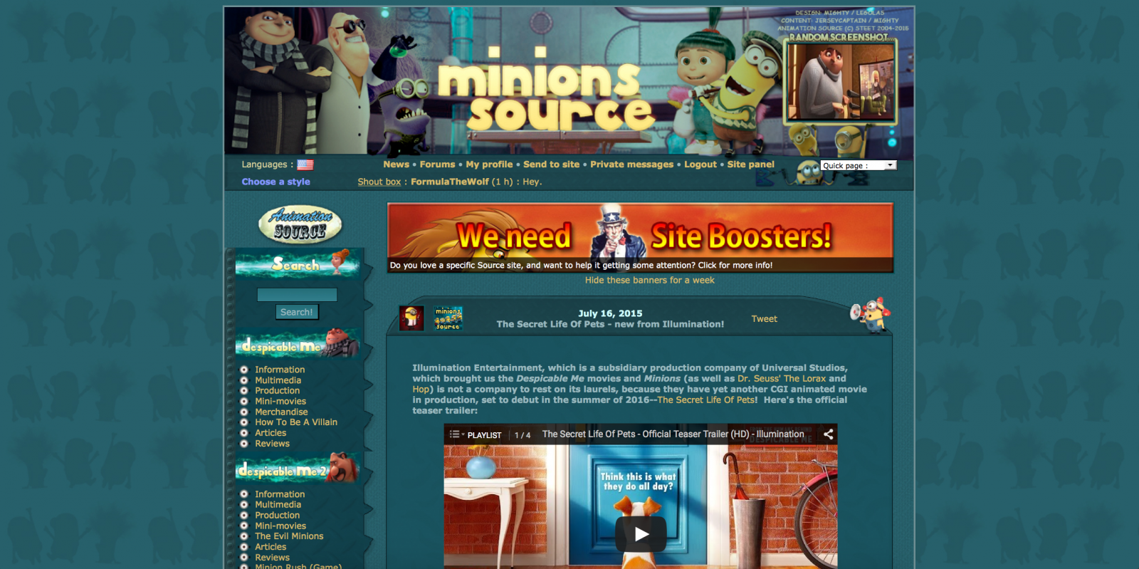
To enable this design on your account, click on the "choose a style" found on the lower left hand corner of the banner. From there, click on the banner that says "alternate design."

Last comments
| July 19, 2015 | ||
Fan chars mod   | ||
| Grande M�chante Admin ~ |

Indeed you can not please everyone, but that's great to see you're
trying anyway without saying one way is better than another =)! I
personally appreciate the effort! |
| July 19, 2015 | ||
Site Builder (Content), Site Builder (Gr...  | ||
| Path of the Demon |

Thanks, Nakou! It was in our intentions to make Minions Source as
unique as possible, and that was one of the things I thought of. |
| July 19, 2015 | ||
 | ||
| O' Cap'n My Cap'n! |

Thank you, Nakou! Again, the bottom line is that we were trying
everything possible to accommodate as many people as possible. As
Draco wisely said to Mighty and I, "you can't please everyone" (sound
logic...and I've known that for a long time), but if there is a desire
to try, well, that counts for something. Some people are just naturally preferential to certain colors and color combinations than others. It's a very personal thing for each individual. We get that. Totally. I mean, I don't like the aquamarine color scheme on TaleSpin Source. But it doesn't, personally, repel me enough to not look through it when I want to, because the material is worth the time. Does that mean that I think (as a few people did when they overreacted to what I posted in the fan news) that steet was wrong in using those colors? Not at all. He designed it based upon his own preferences and in keeping, I presume, with whatever colors he thought most reflected the TaleSpin milieu (the aquamarine, I presume, reflecting the tropical setting of the series). I get that. Totally. But I appreciate the sensible and respectful way you worded your comment. Thank you for that! |
| July 19, 2015 | ||
| Fan chars mod | ||
| Grande M�chante Admin ~ |
I personnally prefer this one =3 I like yellow and purple but not the
ones of the other design who are distractive. I'm one of the people
who find them too bright. I couldn't concentrate myself on the
informations, but it's perhaps because we aren't used to bright colors
in France. Anyway, it's cool to adapt with a design you can choose and
to think about everyone, thanks for that ") And by the way, I like the idea of the minion on the right side of the title informations, it's a cool addition! =3 |
| July 19, 2015 | ||
| Site Builder (Content), Site Builder (Gr... | ||
| let�s go lesbians! |

Yeah, I agree I prefer the original layout, though. I like yellow and
purple, especially if they're placed together nicely. I don't know
what k would do without variety. |
| July 19, 2015 | ||
| Site Builder (Content), Site Builder (Gr... | ||
| Path of the Demon |
I hope it does! If they don't, then I'm at a loss!  But I'm glad
Steet has given us the option to choose between layouts, otherwise the
color could have been a potential problem (even though I don't think
the yellow color is too bright"). But I'm glad
Steet has given us the option to choose between layouts, otherwise the
color could have been a potential problem (even though I don't think
the yellow color is too bright"). |
| July 19, 2015 | ||
| Site Builder (Content), Site Builder (Gr... | ||
| let�s go lesbians! |
I'm sure this will be suitable to those who didn't like the bright
background. I didn't mind the brightness, but some of the sources have
a couple styles. I didn't think to say it before, but to have more
than one option to choose from is a nice touch. |

Return
Despicable Me reads and more


Site activity
- How did you hear about Despicable Me? Jack A Wojtowicz - 252 days
- Pirate Period: A lost treasure? Mighty - 1,817 day
- Billboard's year-end top 100 hits of 1968 Mighty - 1,834 day
- Do you own any items? Elliotdragon - 1,946 day
Forum
- Excellent Movie and loveble Charecters :) The Minions are definitely m...Tanshir - 1,288 day
- I'm happy to hear that it isn't too harsh on the eyes. :) Thanks!Mighty - 1,293 day
- I like this retro look. :icon307: Nice on the eyes, not harsh at all. happystool - 1,293 day
- I didn't know there was a 2nd Minion movie planned (and this one reall...Nakou - 1,294 day
Site
Members online
| + 34 other visitors |


